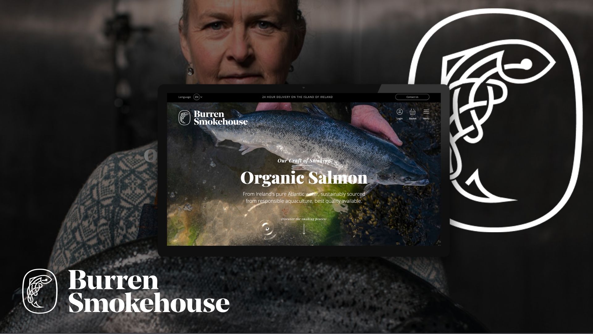
Break the consumer’s barrier to consuming seafood online and create a sensorial experience on the digital space.
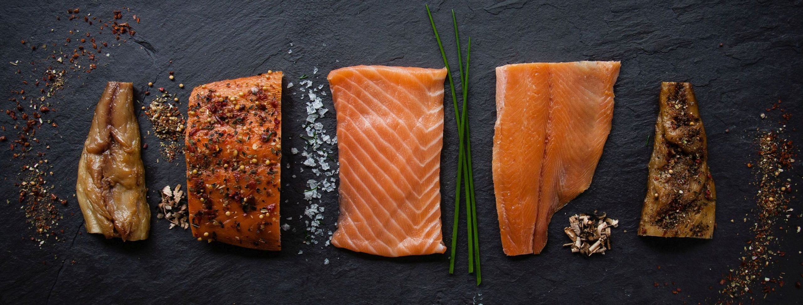
As part of this project and the partnership with Bord Bia, we leveraged their research study, ‘Selling Meat & Seafood Online’ explored shopping habits online, in particular for meat and seafood, in order to identify ways to win in online retail and drive growth in each of the respective sectors.
Thus, we identified two main barriers to the online purchase of seafood:
01. Sensory Connection
02. Store to Door Freshness
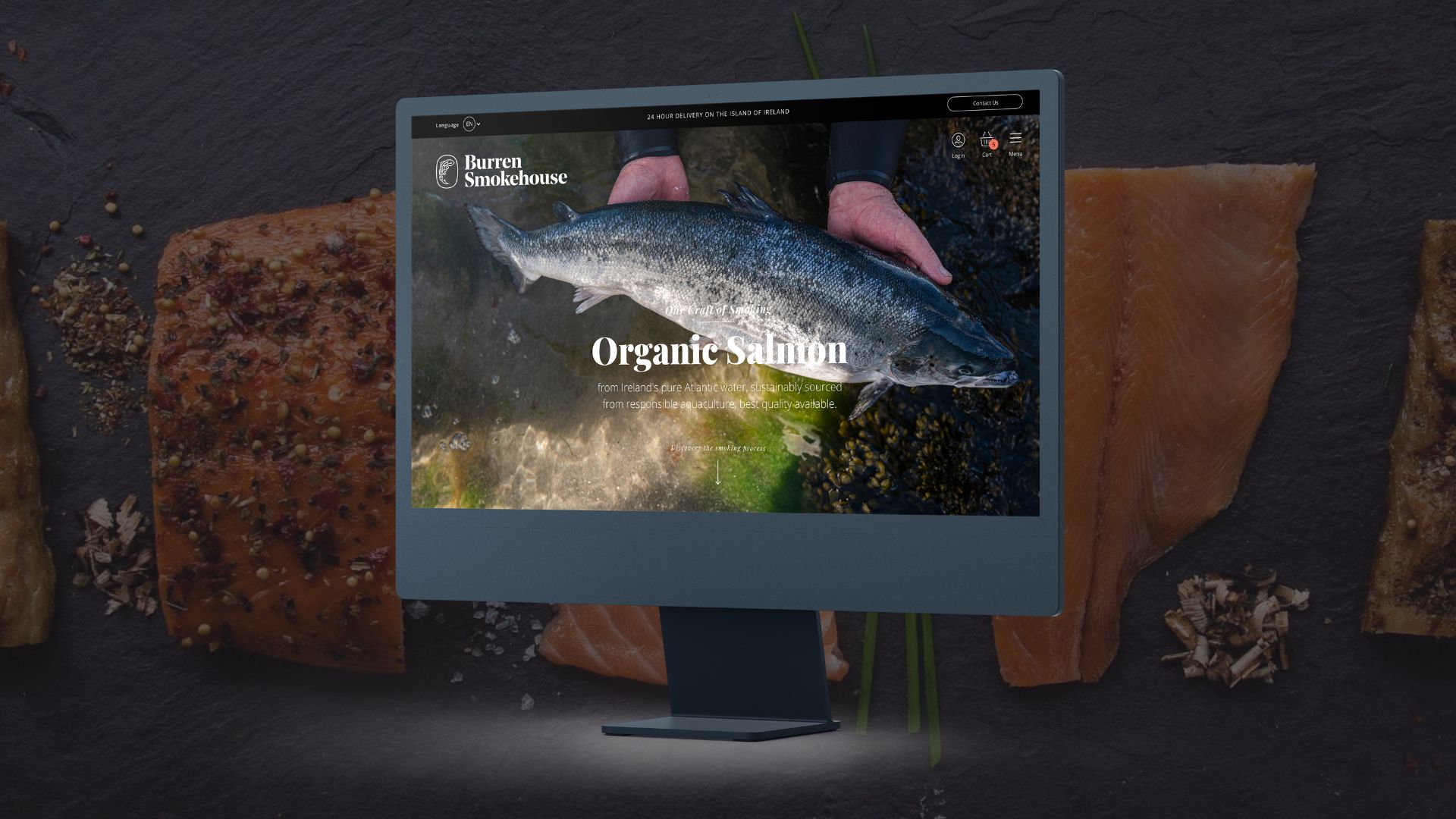
It was important to elevate the aesthetics of the website so as to heighten the visual appeal and curate a cohesive narrative of the brand.
Intuitive and responsive design was a key touchstone here.
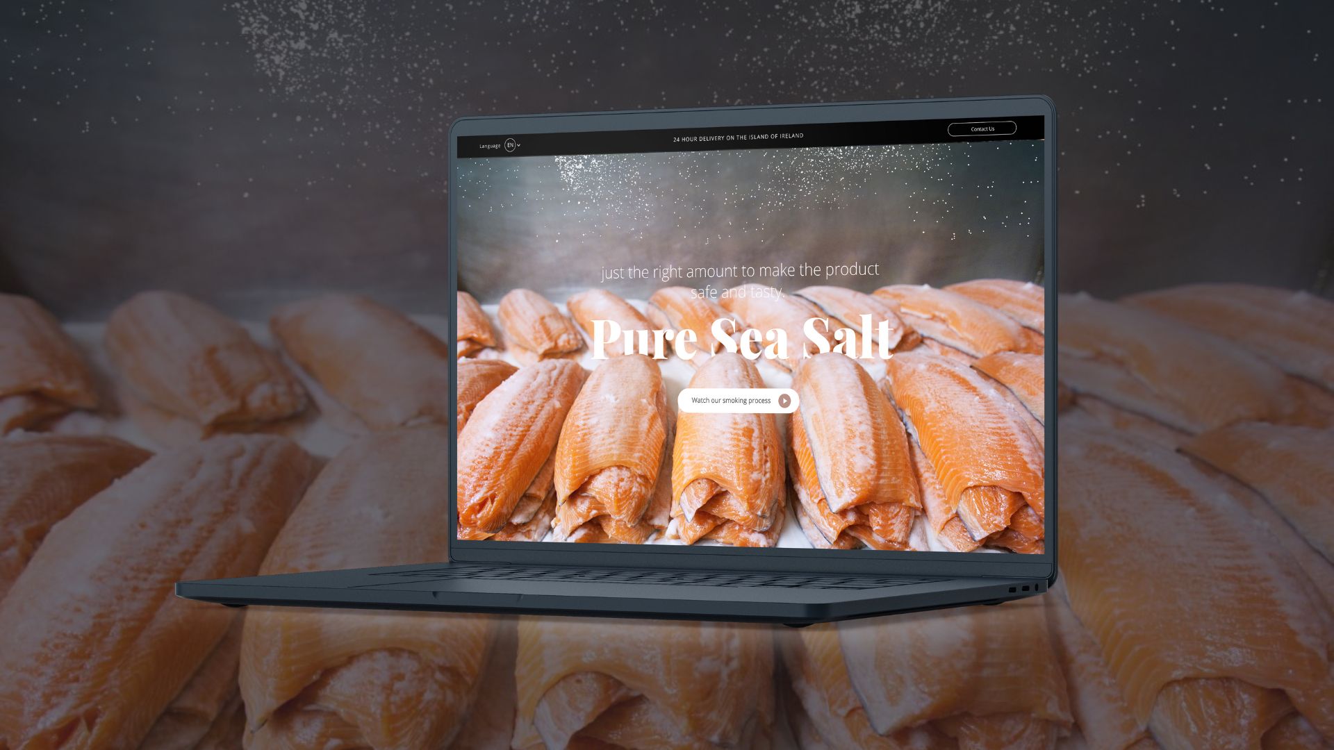
The animation-rich process page, high-quality photography, and call-out banners allowed us to lead the user by the eye, allowing for minimal mining to engage with and discover key website content.
High quality imagery of product and space enhanced the sensory experience by conveying the unique landscape that is so integral to The Burren Smokehouse brand and their award-winning smoked salmon.

As identified in our research study, a repeated theme among online grocery shoppers is that it makes life easier.
Anything that does this is valued strongly.
For this reason, a delivery calendar that allowed consumers to select their chosen delivery date was included in the check-out.
We created a multilingual site rather than a multi-site. This allows users to toggle between English, French and German.
The geo-location feature allowed us to show products that were only available in certain markets to ensure no frustration at check-out.
The online shopper is a smart shopper who seeks out deals and budgeting opportunities.
The new Burren Smokehouse loyalty scheme allows consumers to feel they are getting access to exclusive, better quality deals in addition to building a community of loyal consumers.
Best-seller features enable first-glance decision-making for visitors to the site.
Lastly, a review feature was integrated into the shopper journey because we know shoppers are nudged through star ratings, reviews, and recommendations.
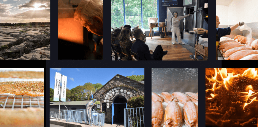
Granite focused on delivering a heightened visual appeal that would accentuate the freshness of The Burren Smokehouse’s products.
Central to this strategy was the creation of a cohesive narrative that seamlessly communicated the essence of the brand, reinforcing its commitment to quality and innovation.
The website redesign also prioritised user experience, featuring an intuitive and responsive design that ensured visitors could navigate with ease and efficiency.
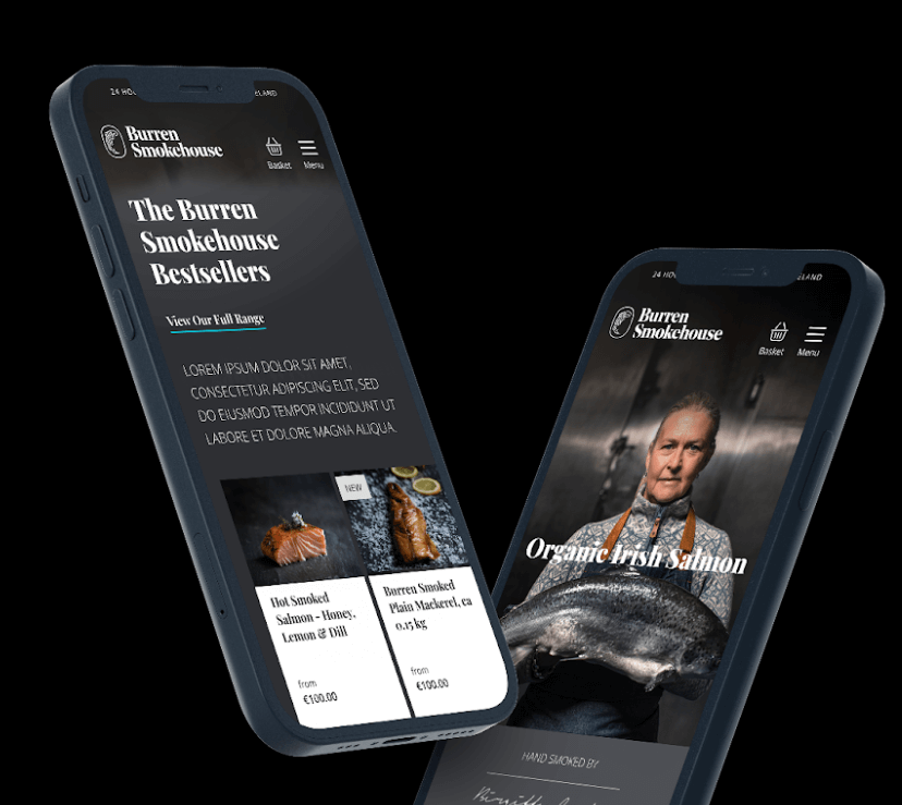
Burren Smokehouse’s website delivered strong business results.
©GRANITE